A folding linen tester from Carson: a 30 mm lens with 5x magnification on a stand that folds flat, with inch and centimeter marks on the base. Printers and print designers use a loupe like this on press checks to look at halftone dots, registration and fine type. The Bureau of Labor Statistics lists checking designs for errors before they are printed as part of the job, and a loupe is the old-school tool for it. It costs little and fits in a pocket or a pen cup. A designer who works only on screen will use it less, though many still pull one out for packaging samples and business cards.
Pros
- Classic print-check tool
- Folds flat for a pocket
- Very low cost
Cons
- Less use for screen-only designers
Best for: checking press proofs and print samples
A 12-inch stainless steel pica pole from Pacific Arc with pica, point, agate and inch scales on one ruler. The listing says the marks are etched into the steel, so they survive years of handling and solvents. Print and editorial designers use a pica pole to measure type size, leading and column depth on a printed piece, and to check a proof against the layout. It also doubles as a straightedge. Plenty of designers learned on one in school and never bought their own, so it is a practical gift that still feels like a nod to the craft. A designer who works only on screen may leave it in a drawer.
Pros
- Measures in the units designers use
- Etched marks will not wear off
- Doubles as a straightedge
Cons
- Less use for screen-only work
Best for: layout and print designers
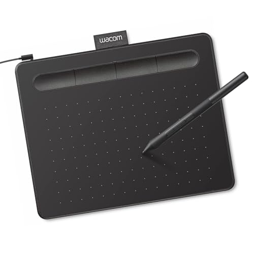
Wacom's small wired pen tablet, with a battery-free pen and four ExpressKeys for shortcuts. It plugs into a Mac, a Windows PC or a Chromebook and works with any design software. Graphic designers spend a lot of time drawing paths, tracing marks, retouching photos and masking, and a pen does that with more control than a mouse. The small size fits next to a keyboard, though someone who draws large gestures may want the medium. A designer who already uses a tablet will not need a second one, so ask quietly or check their desk. It also makes a good first tablet for a junior designer or a design student.
Pros
- Pen control for paths and retouching
- Shortcut keys built in
- Works with any software
Cons
- Small drawing area
- Pointless if they already own one
Best for: a graphic designer who still draws with a mouse
The third edition, revised and expanded, of Ellen Lupton's Thinking with Type, subtitled A Critical Guide for Designers, Writers, Editors, and Students. The book moves from single letters to blocks of text to grids, with examples from historical and current design. Many design programs assign it, and many working designers keep it within reach for questions about leading, hierarchy or a stubborn layout. For a junior designer it is a reference; for a senior one, the new edition may be worth an upgrade from a dog-eared older copy. Ask first if you can, since a type-minded designer may already own the latest edition.
Pros
- A standard reference for type
- Useful for juniors and seniors
- Low cost
Cons
- Many designers already own an edition
Best for: graphic designers at any level
Draplin Design Co.: Pretty Much Everything collects Aaron Draplin's logos, posters, merch and side projects, with his notes on process and on running a small studio. Brand and logo designers read it for the work, and freelancers read it for the stories about clients, pricing and staying independent. It has a loud, friendly voice that matches the work. A designer who follows Draplin online may already own it, so check if you can. As a gift for a junior designer, it shows what a long career built on logos and hustle looks like.
Pros
- Lots of real logo and poster work
- Useful for freelancers
- Fun to read
Best for: logo and brand designers
A 12-ounce fine china mug from the Pantone Living collection by Copenhagen Design, in Violet 519 with the Pantone logo and color code on the side. Graphic designers who choose spot colors for a living tend to love anything shaped like a Pantone chip. It is dishwasher safe and big enough for a proper coffee. The color matters, so if you know the designer's favorite, or their brand's color, look for that number in the same collection. Other colors in the line go in and out of stock. It makes an easy coworker gift that still says you know what they do all day.
Pros
- Instantly reads as a designer gift
- Fine china, dishwasher safe
- Many colors in the line
Best for: a designer who speaks in Pantone numbers
The 50th anniversary edition of Josef Albers's Interaction of Color, published by Yale University Press. Albers taught that a color looks different depending on the colors around it, and the book's exercises show it with paper studies. Graphic designers who build brand palettes, choose background colors or fight with a client about why the logo looks different on a dark site will find the ideas useful. It is a short paperback and an easy add-on to a mug or a postcard box. A designer who studied at an art school may already own a copy, since many color courses use it.
Pros
- A classic on how colors behave
- Short and affordable
- Useful for brand palette work
Cons
- Common on art school reading lists
Best for: brand and color work
An 11-ounce white ceramic mug from Panvola with a joke about file naming: the endless chain of final, final final and final for real this time. Graphic designers recognize it at once, because revisions are part of the job. The Bureau of Labor Statistics lists presenting concepts and revising them based on feedback as a core duty, and every round adds a file. The mug works for a studio Secret Santa or a desk gift after a long project. It is a plain printed mug, so the gift lives on the joke. Pair it with a bag of good coffee if you want more to unwrap.
Pros
- The joke lands with any designer
- Cheap enough for a swap
- Safe for a client-facing desk
Cons
- Plain mug apart from the print
Best for: the studio Secret Santa
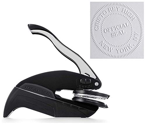
A custom hand embosser from Pickled Stamps. You upload a design or logo, best as a high-resolution black and white file, and the seller makes a seal that presses it into paper. For a graphic designer with their own mark, it turns business cards, letterhead, envelopes and printed samples into branded pieces with no ink. The Bureau of Labor Statistics counts about one in five graphic designers as self-employed, and a freelancer will use this on every client package. The file needs clean lines, so ask the designer for their logo file or wait for a time you can get it. Allow extra days for the seller to make it.
Pros
- Uses the designer's own logo
- Works on cards, letterhead and samples
- Feels like a tool, not a trinket
Cons
- Needs a clean logo file
- Made to order, plan ahead
Best for: a freelancer or a designer with their own mark
Pantone's Color Bridge guide for coated stock, the current edition with 224 new colors. It shows all 2,587 Pantone spot colors next to their closest CMYK process match, with RGB and HTML values printed for each. Graphic designers use a bridge guide to choose a brand color that will hold up in print, on screen and on the web, and to show clients why a spot color shifts when it prints in four colors. A guide fades with light and age, so a working designer replaces it every so often, which makes a new one a welcome team gift. Check coated or uncoated before buying, and check which edition they have.
Pros
- Daily reference for brand color
- Spot, CMYK, RGB and HTML in one deck
- Replaces a faded old guide
Cons
- Coated only; uncoated is a separate guide
- Costs as much as a pooled team gift
Best for: brand and print designers who spec color